Launch Your Website in Just 5 Days
The Hues of Tomorrow: Design Color Palette Trends for 2026
DIGITAL MARKETING
12/29/20253 min read


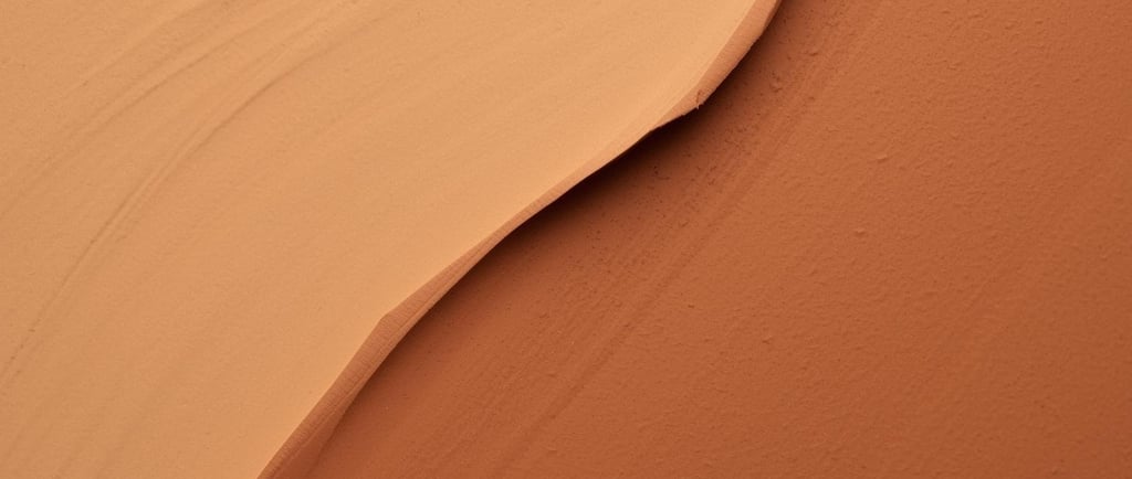
Chapter One: Dawn of the Warm Neutrals
The first to appear was Clay Sienna, walking in with the quiet confidence of someone who knows they’ve been missed. Earthy, grounding, and deeply human, it carried the warmth of handmade pottery and sun‑baked walls.
Right behind it came Soft Oat, a gentle companion with a calming presence. Designers welcomed it like an old friend—reliable, comforting, and endlessly adaptable.
Together, they whispered:
“Slow down. Create with intention. Let warmth be your foundation.”
Every January, designers around the world gather—some literally, most spiritually—around the glowing altar of trend forecasts. But 2026 felt different. It wasn’t just another year of palettes and predictions. It felt like the colors themselves were whispering, tugging at our sleeves, asking to be seen.
This is the story of how the 2026 color palette didn’t just trend—it arrived like characters in a novel, each with a personality, a purpose, and a message for the year ahead.
Chapter Two: The Return of the Cool Rebels
Just when the room felt too serene, the door swung open and in rushed the cool tones—bold, refreshing, unapologetic.
Digital Teal arrived first, shimmering like a pixel caught between worlds. It represented the merging of physical and digital spaces—AR interfaces, futuristic branding, and immersive web experiences.
Then came Glacier Blue, crisp and clean, carrying the energy of innovation. It felt like a breath of cold air in a crowded room, reminding designers that clarity is still a luxury.
They declared:
“The future is cool, crisp, and beautifully interconnected.”
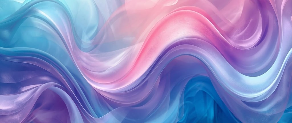
Chapter Three: The Soft Dreamers
Floating in like a daydream, the pastels made their entrance.
Blush Mist—barely pink, almost a memory—brought softness to the palette. It wasn’t the sugary pastel of past years; it was more mature, more poetic.
Beside it, Lavender Haze drifted in with a quiet mystique. It felt spiritual, intuitive, and deeply feminine—perfect for wellness brands, wedding aesthetics, and romantic storytelling.
Their message was simple:
“Let softness be strength.”
Chapter Four: The Bold Disruptors
And then… the disruptors arrived.
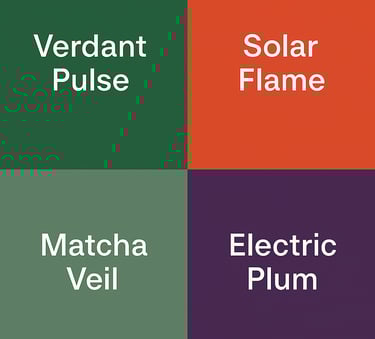
Solar Flame, a vibrant orange‑red, burst into the scene like a spark ready to ignite. It demanded attention—perfect for campaigns that want to be remembered.
Electric Plum followed, dark and dramatic, a color that refuses to be ignored. It’s the shade of nightlife, luxury, and daring rebrands.
They roared:
“Make a statement. Be unforgettable.”
🌿 Chapter Five: The Green Renaissance
Finally, the greens entered—not quietly, but with purpose.
Verdant Pulse, a rich botanical green, symbolized regeneration and sustainability. It felt alive, like a forest after rain.
Matcha Veil, softer and more muted, brought balance. It was the color of mindful living, slow mornings, and eco‑friendly design.
Together, they reminded us:
“Design is not just visual. It’s ethical.”
🌈 Epilogue: What These Colors Mean for 2026
As the palette gathered, something became clear:
2026 isn’t about choosing one direction—it’s about embracing duality.
Warmth and coolness
Softness and boldness
Nature and technology
Serenity and disruption
Designers this year aren’t following trends—they’re telling stories. And these colors are the characters helping them do it.
The 2026 palette is emotional. It’s intentional. It’s human.
And maybe that’s the real trend:
Design that feels alive.
Design boldly. Tell your story with Ouma Digital.
Subscribe to our newsletter
Address
505-6300 Avenue Auteuil, Brossard, Qc J4Z 3P2